What Building Mobile Apps Taught Me About Constraints
Mobile development forces decisions that web development lets you defer. Working under those constraints changed how I approach every product I build.

I came to mobile development late. My background was web — HTML, CSS, JavaScript, the browser's forgiving rendering model and essentially infinite screen real estate. Mobile felt like a step down at first. Smaller screens. Fewer APIs. More constraints.
I was wrong about the "step down" part. The constraints weren't a limitation — they were a discipline.
The Mobile Contract
Every mobile app exists within a contract with the user. That contract has terms the web doesn't have:
Permission is explicit. You can't quietly access location or send push notifications. The user must say yes. This forced explicitness is uncomfortable for product teams used to silent data collection but better for everyone in the long run.
Network is unreliable. On the web, you can usually assume a decent connection. On mobile, users are in basements, on trains, in markets with three bars of 3G. Every feature you build needs to answer the question: what happens when this fails?
The back button is software. Navigation on mobile isn't implicit. You have to build it, think about the stack, manage state across screens. This is annoying until you realise it forces you to think about your information architecture in ways that web development never demands.
Touch is imprecise. Fingers are not cursors. Hit targets need to be at least 44×44 points. Hover states don't exist. Swipe gestures conflict with system gestures. Every interaction assumption from web needs to be re-examined.
React Native: What Works and What Doesn't
React Native lets web developers build mobile apps without learning Swift or Kotlin. That's both its strength and its weakness.
What works well
The component model. If you know React, the component model is the same. Thinking in state, lifting state up, composing components — all of it transfers.
Expo. The managed workflow handles the painful parts of React Native: native modules, build configuration, over-the-air updates. For 80% of apps, Expo handles everything you need.
React Query. Data fetching patterns that work on web work equally well on mobile. Caching, background refetching, optimistic updates — all of it carries over.
// Same pattern, works on web and native
function useEssays() {
    return useQuery({
        queryKey: ['essays'],
        queryFn: fetchEssays,
        staleTime: 5 * 60 * 1000,
    });
}
What doesn't transfer cleanly
CSS doesn't exist. React Native uses a subset of flexbox with JavaScript objects. No CSS variables, no cascade, no pseudo-selectors. This trips up web developers constantly. The mental model shift is real.
Performance is unforgiving. On the web, you can render a lot and let the browser handle it. On mobile, a heavy FlatList with no optimisation will drop frames visibly. memo, useCallback, virtualization — these aren't optional polish, they're table stakes.
The JavaScript thread. React Native runs JavaScript on a separate thread from the UI. Animations and gestures that block the JS thread will stutter. This is why react-native-reanimated (which runs animations on the native thread) exists and matters.
// react-native-reanimated — runs on UI thread, never drops frames
const animatedStyle = useAnimatedStyle(() => {
    return {
        transform: [{ translateX: withSpring(offset.value) }],
    };
});
The Lesson That Transferred Back to Web
Building mobile apps changed how I think about web products. A few things that carried over:
Offline-first thinking. I now ask, for every web feature: what happens when the user has no connection? Even if the answer is "show an error," it's better to have thought about it than to let a blank screen speak for you.
Progressive disclosure. Mobile screens force you to be ruthless about what goes above the fold. That discipline applies on web too. Every screen should answer: what's the one thing the user needs to do here?
Touch targets on web. After years of building for thumbs, I'm aggressive about button sizes on web interfaces too. A 32px button that works fine with a mouse is frustrating on a tablet in touch mode.1
Permission-seeking language. Mobile taught me that the way you ask for something matters as much as what you're asking for. The timing and framing of permission requests — on mobile and on web — dramatically affects acceptance rates.
The Project That Changed My Perspective
The most instructive mobile project I worked on was a simple one: a field data collection app for a logistics company in Lagos. The users were delivery drivers with mid-range Android devices and inconsistent data coverage.
The original web approach — online forms, real-time sync — failed immediately in field conditions. We rebuilt it as a React Native app with SQLite local storage, background sync, and optimistic UI that assumed actions would succeed before confirming with the server.
The tech wasn't revolutionary. What was revealing was how differently I had to think about the product.2 Every assumption I'd built up working on consumer web apps had to be interrogated. That interrogation made me a better product thinker — not just for mobile, but for everything after.
Footnotes
-
The WCAG 2.5.5 success criterion recommends a minimum target size of 44×44 CSS pixels for interactive elements. This is often treated as an accessibility concern, but it's really just good design for any user. Fat-finger errors on small targets are frustrating regardless of disability status. ↩
-
This experience is what pushed me toward outcome engineering as a practice. When you're building for users in genuinely constrained environments, you can't afford to ship features that don't directly solve a problem. The feedback is too immediate and too honest. ↩
More essays
View all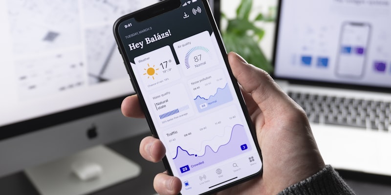
Rust • February 10, 2025
Outcome Engineering: The Discipline of Building What Actually Matters
Most engineers build features. Outcome engineers build results. The distinction sounds small but changes everything about how you approach a problem.

Go • February 1, 2025
What Building My Portfolio Taught Me About Product Thinking
A portfolio is just a product with one user. Here's what building mine taught me about design decisions, scope, and shipping things that aren't perfect.

Typescript • January 28, 2025
Animation That Works: Making Interfaces Feel Alive
Most UI animation is decoration. The best animation is communication. Here's how I think about motion in product interfaces and what separates good animation from noise.